
California DMV Visit Appointment Redesign
Tools: Figma
Type: Individual Project
Duration: 4 weeks
Role: User Research, Product Designer, Usability Testing
How Might We assist users in making a smooth office visit appointment through DMV.ca mobile web?
Background
The California Department of Motor Vehicles (DMV) is the state agency that registers motor vehicles and boats and issues driver's licenses in the state of California. When I try to renew my Real ID using office appointment option at DMV.ca on my mobile phone, I am confused about the appointment process. As part of a 4-week individual assignment for my Product Design Studio course at UC Berkeley, I redesigned DMV office appointment process with the primary goal of reduce the frictions and confusions of scheduling process and improve the DMV appointment user experience.
Final Design
Define Problem
Problem
Users get confused of word expression and appointment process during the scheduling of office visit at DMV.ca website. These frustrations could make users quit the online appointment process easily.
Objective
Through reducing the lengthy appointment process and reorganize scheduling steps to reduce the appointments drop-out rate and create a smooth scheduling experience.

Target Users
Californian adult residents who speak English fluently and don’t have disabilities.
They use DMV mobile website to make appointment of renewing “Real ID”.
Research and Analysis

In order to fully understand users’ pain points of current appointment system, I conducted 5 User Interviews; performed Heuristic Evaluation to analyze current appointment flow and did Competitive Analysis of some appointment scheduling system including: GRE Test Scheduling and Apple Support Reservation.

Current Design Analysis

User Journey Map
Based on the analysis, I summarized the main tasks users perform during the scheduling process and the main information required by DMV.ca.

Insights of Preliminary Research
Based on the above analysis and research, here are the main pain points:
Text-heavy and lengthy appointment system
The whole system doesn’t have a clear progress bar to indicate the scheduling process. Besides, the whole process is long with lots of text on each screen. Too much text is not user friendly especially on mobile phone.
Confusing words and bad interaction design
There are some unclear words and inconsistent expressions on the appointment website. For example, users are required to fill up how many items are they going to process. The definition of “items” are mixed with tasks and people. One person performs one task is one item. One person performs two tasks is two items. Two people perform one task each is two items. Users are easily confused of processing so much information in a short time.
Besides, when the website asks users to select DMV office they preferred, it uses the dropdown list of 30+ DMV offices in California. Many users state they are unfamiliar with most of the offices and they feel anxious of finding the one that close to them. In addition, the interaction of the Map and Calendar is bewildering. Clicking “Map” will open a new browser window and It displayed bottom half of california map horizontally next to the top half of the map. Users can not use their common “move around” way to interact with the map, they need to discover by themselves to tab the certain area of the map which will open another new browser window. Users are required to choose the office from the long office list and check the availability, if there is no available slots, they need to choose the office again. And users don’t have the choice to filter the office by time availability.
Moreover, the calendar view doesn’t grey out those unavailable date, which also causes confusion to users.
Unclear Visual Hierarchy and Repeated Request
The whole appointment system is very text-heavy with no clear visual hierarchy. Besides, a lot of information are asked repeatedly. For example, users’ telephone number is asked when they input appointment information, and is asked again when user select notification methods. If users want to edit their appointment time, they need to go back to the beginning of the office selection phase and redo everything again.
Design & Iteration
Ideation
For each insight stated above, I purposed different solutions to address those issues. Throughout my design, I hope to achieve the following design objectives:
Clear user progress flow
Flexible office selection based on distance or available time slots
Reduce lengthy and heavy--text form and eliminate unclear wording/expressions
Better information display and visual hierarchy


Iterations
Based on the new user flow and design objectives, I designed different screens and performed usability testing.
Here are some of the feedback I received from the usability testing.

Feedback for “reasons of visit”
Progress bar helps users to figure out the overall steps of the appointment system. The estimated time for finishing the scheduling helps mobile users to decide if the current time is the good time to make the appointment.
Icons of the each reason provide better visual cue to illustrate different categories
Users are confused about “number of visitors” in the last design, they don’t quite understand the reasons of choosing 2 people or 3 people.


Feedback for “Interactive Maps”
Users mention that the first design (left) contains too much information which causes lots of distraction. Some of those information are unnecessary at “select location” step
The word “reserve” caused some confusion to users, it’s better to use more direct way to indicate its office selection.
Feedback for “Basic Information”
The first “Basic Information” design (left) contains too much information and the text are very small. It’s hard for users to fill in all those requirements
Users prefer the way to combine notification method and basic information on the same page. They don’t need to input the same information multiple times
Final Design & Rational
After all the research and feedback, these are final designs.
Purpose of visits
Reasons for Visit
The long scheduling process was broken down into multiple steps with progress bar. Color Blue indicates the current step while Yellow showcases the finished steps. As this is the first step of the whole scheduling process. I designed the time estimation for reference.
Visual icons clearly represent different reasons. Users are able to click on question mark for more explanation.
Click on the office visiting purpose will lead to the follow up selection of how many people request for the services. This will help DMV offices to control the time allocation as well as help users to understand the “item” concept.
Select Office Location

Select Office location
Find a DMV office is based on users current location or typed location. The system will provide the nearest 8 DMV offices or (offices within 20 mi) The offices can be filtered in the order of distance or availability. This provides more flexibility for users to select the most suitable office and time slot.
Map Icon directs users to an interactive map. Map shows users’ current location, Users can also move around the map and find out DMV offices in that area.
If users click on the specific office on the Map for example: San Francisco DMV, the map will list the availability, distance and address of that office.
Users are able to select office directly through the map. Interactive map provides more useful information to users and it increases user engagement. Through these interactive and flexible choices, it could increase users willingness to complete the online scheduling process.
Select Time Slot
Select time slot
Compared to the current DMV calendar design, The new calendar greys unavailable date.
On the time slots page, I also add “Next” button to indicate the expecting action. My first design doesn’t contain the “Next” button, when users click on a time slot, it will direct them to the next page. Users feedback on this: they don’t expect select the time slot will direct them to the new page. They expect a confirmation (feedback/response) here. Therefore, I add “Next” button.
Fill in Basic Information & Review
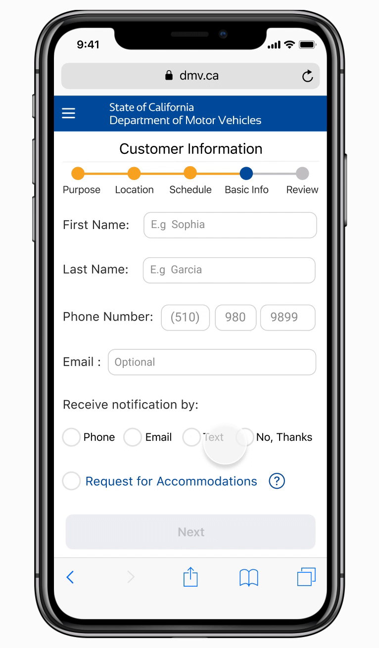
Customer Information and Summary
Notification methods and basic information are on the same page for the consistent user flow design. Instead of restarting everything when users edit their appointment or basic information, all the information has been temporarily stored in the system. Thus, after finishing editing the information, users are directed to the summary page.
I also reorganized information on the summary page to present information in better visual hierarchy.
Confirmation

Confirmation
On the confirmation page, It shows the appointment status and the purpose of the QR code. The QR code is not readable for users and users might forget where they stored the QR code. Instead, I provide them options to add QR code to their Apple Wallet and add to calendar to help users better organize these confirmation information.
The details of the appointment information including the payment method, distance, directions and websites are listed here. Compared to my previous iterations which I display all these information at office selection page, users have more time to check these information after making appointment. These information are more useful to them at this stage.
Design Outcome
Feedbacks
“The new design is more clear and flexible than the original design. I like the progress tracker which tells me my current step. Limited office selection reduces the cognitive overload for users. I can now select office by their distance and availability, these provide me more flexibility. The overall visual is very clear as well. I love “add to wallet” and “add to calendar” functions. Those details really improve the user experience.
— DMV office visiting appointment (mobile) user
“Your design seems to make the process of getting an appointment for Driving License renewal more "smooth (without any difficulty)". This will surely also meet the business goal of increasing success rate and reducing friction. I appreciate the estimation for the time left. I also think your scheduling solution was well thought out. Good job.”
— James Reffell, Instructor & Design Director at Clever